Extending Northwest's brand into a living system.
A clean logo system, given emotion, story, and life.
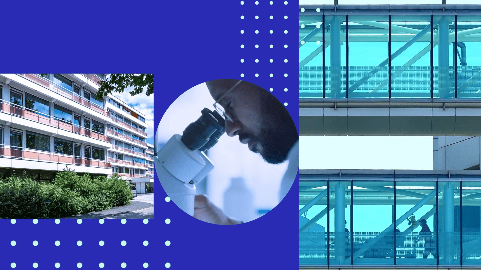
a circle for people,
a square for place.
That foundation, extended, turning two static shapes into a living visual language, the part of a brand that exists beyond the logo.
A brand isn't just how it looks standing still. It's how it moves, behaves, and carries itself.
That's the part we built. The brand didn't just look good. It came alive.
The client
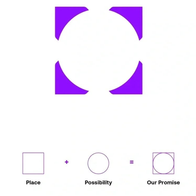
Taking the status quo and making it status whoa is definitely our jam. That's why we didn't hesitate when 50,000feet and Northwest Healthcare Properties approached us to help them reimagine the stuffy (read: boring) corporate videos commonly seen in the healthcare real estate industry.
the ask
From storyboards to animation, stock video selects, talent search and VO recording, music research and sound mixing, we had to make the vision of Northwest Healthcare Properties and 50,000feet come together in a unified way. The goal? An engaging brand video that was super contemporary, emotionally captivating, and effortlessly educational.
The answer
Using the fantastic rebrand dreamt up by 50,000feet, we deconstructed the logo and used the hero shapes as a device to move the story forward. Circles and squares transport you effortlessly from one scene to the next, while highlighting central themes, and supporting key visuals.



Director of Client Services
50,000feet
"The video was received incredibly well. Nothing but great things.”
Behind the build
Two shapes,
one language
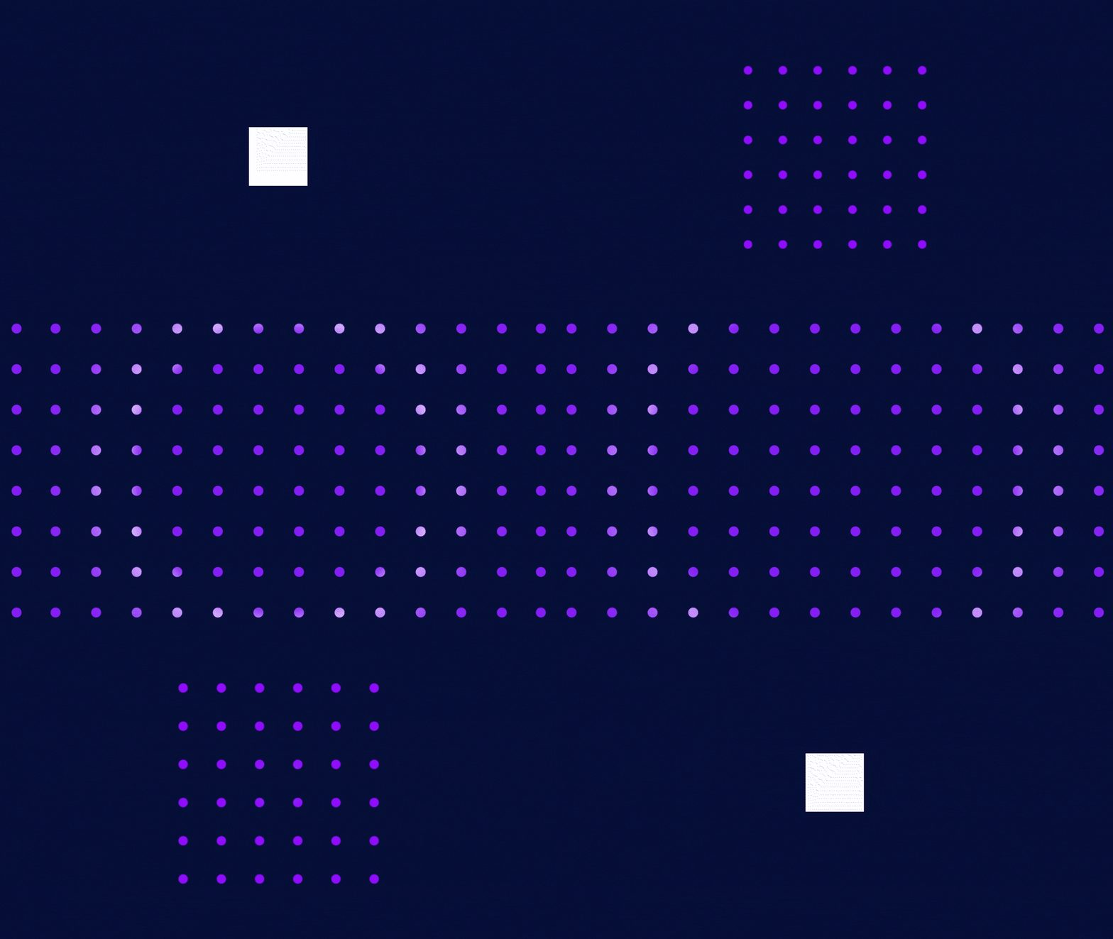
The circle and square became the brand's vocabulary. Scaled, layered, and moved with intent, they carried the eye and the message from beat to beat, the same way a logo anchors a page.
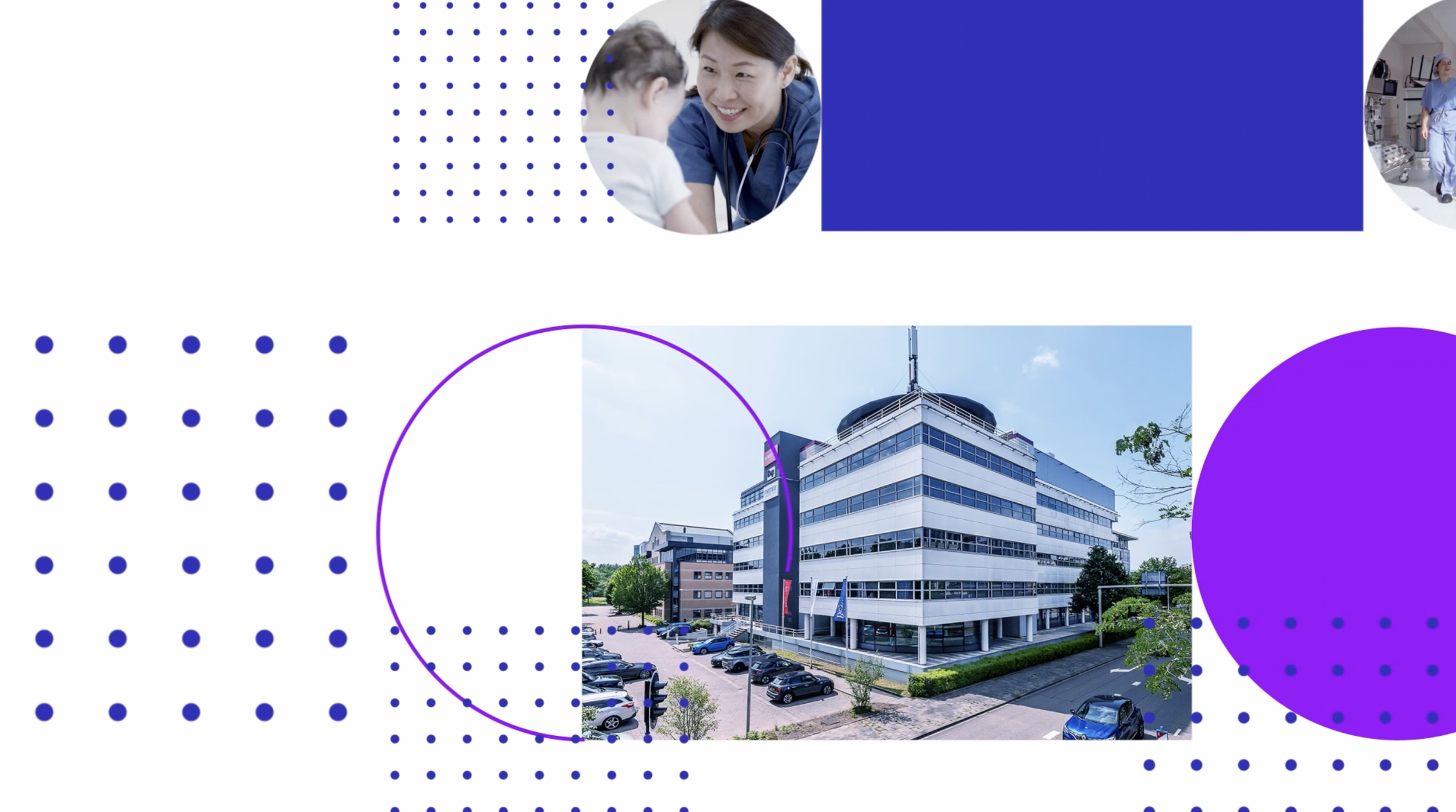
Behaviour by design
Consistent, deliberate, unmistakably Northwest. The shapes guided the whole journey the way a strong brand system guides everything it touches.
Simple to sensational
Northwest's identity is minimal by design. That restraint became a strength, expanding two basic shapes into a rich, cohesive world. Proof that a brand's simplest parts can carry its biggest moments.

YOU MAY ALSO LIKE